Florence & Rothko: How the Renaissance City is Reinterpreting Modernism This March
- Artful Italia

- Mar 10
- 3 min read
Florence, the cradle of the Renaissance, is a city intimately acquainted with artistic revolutionaries. This March, however, it is not the works of Michelangelo or Donatello that are causing a stir, but rather a profound dialogue between Florentine heritage and the mid-century master of abstract expressionism, Mark Rothko. At Artful Italia, we believe this is not a collision, but a powerful reinterpretation, revealing a hidden shared language of color, form, and spiritual resonance.

Who was Mark Rothko?
For those unfamiliar with his work, Mark Rothko (1903–1970) was a titan of Abstract Expressionism. He is world-renowned for his "multiforms"—immense canvases featuring stacked, hovering rectangular bands of color. Rothko did not paint "things"; he painted human emotions like ecstasy, tragedy, and doom. By layering thin glazes of pigment, he created a sense of "inner light" where the colors appear to glow from within the canvas—a technique that mirrors the luminous depth found in the sacred frescoes of Fra Angelico.
The Sacred Language of Saturated Light
Mark Rothko is renowned for his large-scale color field paintings—canvases featuring floating, stacked rectangles of luminous color. While often viewed solely through the lens of mid-century Modernism, a closer inspection reveals a deeper connection to the sacred art that Florence holds dear.
Florentine Renaissance artists, particularly in their fresco work, utilized color not just for description, but to evoke emotion and create a sense of the divine. Rothko’s fields of saturated color, achieved through layers of thin glazes, function similarly. They create a spiritual "envelope" for the viewer. This March in Florence, exhibitions are subtly drawing these parallels, inviting viewers to see Rothko's modern fields of light not as distinct from the frescoes of Fra Angelico, but as an evolution of their spiritual intent.

The Florence & Rothko Dialogue in Your Design
At Artful Italia, we are particularly interested in how this cultural reinterpretation influences interior design, especially the concept of "atmospheric luxury." The dialogue between Florence and Rothko provides a compelling roadmap for spaces that feel both historically grounded and utterly contemporary.
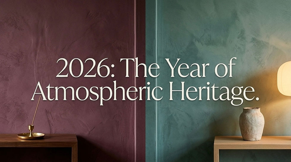
1. The Power of Saturated Surfaces
Inspired by Rothko’s stacked fields, we recommend using profound shades like Divine Damson (a deep plum with cherry undertones) alongside Hidden Gem (a smoky jade neutral). These colors should be applied as a foundation, not just an accent, to create an immersive "Atmospheric Neutral" environment.
2. The Luminous Focal Point
A critical element in the success of a Rothko painting is how light seems to emanate from within the color. The same principle applies to Florentine craftsmanship, particularly with natural materials.
We recommend using objects that provide their own soft, intrinsic glow to break up these saturated planes. Our Artful Italia Marble lamps are a perfect example. These are sculptural pieces of marble with intricate veining, lit from within. The soft, diffused light they provide, especially against a deep burgundy or plum wall, prevents the dark colors from feeling flat and highlights the natural, mineral texture of the stone, creating that crucial atmospheric "high-light."

3. Mixed Metas and Patina
Just as Rothko used layering to achieve complexity, and Florentine artisans utilized mixed materials, modern Florence design embraces "mixed metas." Pair the Divine Damson walls with aged bronze or honed brass accents. These materials provide warmth and a sense of history without being overly polished, allowing the focus to remain on the color fields.
Conclusion
The dialogue between Florence and Rothko this March reminds us that design is not a static linear progression, but a beautiful, cyclical conversation. By looking closely at how the historic city reinterprets Modernism, we gain new perspectives on how to create spaces that are atmospheric, luxurious, and full of quiet authority. This Spring, let the Renaissance city and the master of Modern color fields inspire your next design journey.
Comments